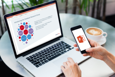
Easy on the eyes.
Utilizing effective visual aids to supplement your presentation can be highly impactful. They help the audience develop a more comprehensive understanding of your content. Typically, these visual aids are presented in slides (via a program such as Google slides, Keynote, PowerPoint, etc.) and they all consist of images and text.
There are two concepts to this equation that will have you creating more effective visual aids in no time. First, images are easier for people to understand and interpret than text. Images are less taxing for the human brain to decode and understood near instantly. Text, on the other hand, takes more time and effort to read, and then interpret (or make sense of given the context). Furthermore, most people tend to focus their gaze on images as their priority, then advance to text afterwards.
Secondly, in North America, many people are taught to consume information by viewing from the top left of a document, to the bottom right of an object. Your eye sweep will naturally follow this pattern as it has been taught, practiced, and reinforced in daily life. Now, being that there are many occasions when both images and text are required on the same slide, what can we do?
The answer is when you’re creating or designing your slides, simply place your images on the left side of your slide and the text on the right. This design is further benefitted by revealing the content systematically. However, the point remains, when you design your slides with images first, you reduce the stress and effort on your audience leading them to follow along more easily and providing your presentation a higher probability of success.


